A
B
Sharper contrast, tighter control, and a campaign language made to feel immediate from the first frame.
Visual Identity
2022
Night Shift

Built for immediacy, the campaign system gives Night Shift a sharper visual rhythm and a more recognizable presence across every release.
Overview
This project called for a stronger visual language that could carry a clear point of view without falling into noise. The goal was to create a direction that feels bold, immediate, and easy to recognize, while still leaving enough flexibility for different formats, launches, and supporting content.
Challenge
The visual foundation was there, but the overall execution lacked consistency and a clear sense of hierarchy. Some assets felt too aggressive, others too neutral, and together they did not form a strong or unified impression. The challenge was to bring more control, rhythm, and intention to the work without losing the energy that made it stand out in the first place.
Our Approach
The system was built around contrast, pacing, and repetition. Strong typographic moments, tighter composition rules, and a more deliberate use of scale helped shape a visual direction that could work across hero images, social assets, posters, motion, and launch materials. Instead of adding more, the focus was on making fewer decisions feel sharper, stronger, and more intentional.
Outcome
The final direction created a more recognizable and cohesive visual presence across 21 delivered assets completed in 4 weeks. The result feels sharper, more controlled, and much easier to carry across different touchpoints, while leaving enough flexibility for future campaigns, updates, and new content.
Jonas Richter (Creative Direction)
Clara Neumann (Brand Design)
Mia Fischer (Copywriting)


“We needed something that could feel immediate without becoming messy. The final direction brought exactly that balance.”
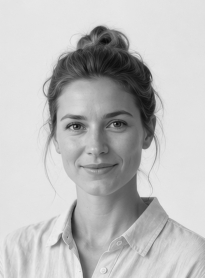
Sophie Keller,
Brand Marketing Lead.
Next project
A colder, cleaner visual language that gives the project more precision, tension, and recall.
Visual Identity
2022
Night Shift
Built for immediacy, the campaign system gives Night Shift a sharper visual rhythm and a more recognizable presence across every release.
Overview
This project called for a stronger visual language that could carry a clear point of view without falling into noise. The goal was to create a direction that feels bold, immediate, and easy to recognize, while still leaving enough flexibility for different formats, launches, and supporting content.
Challenge
The visual foundation was there, but the overall execution lacked consistency and a clear sense of hierarchy. Some assets felt too aggressive, others too neutral, and together they did not form a strong or unified impression. The challenge was to bring more control, rhythm, and intention to the work without losing the energy that made it stand out in the first place.
Our Approach
The system was built around contrast, pacing, and repetition. Strong typographic moments, tighter composition rules, and a more deliberate use of scale helped shape a visual direction that could work across hero images, social assets, posters, motion, and launch materials. Instead of adding more, the focus was on making fewer decisions feel sharper, stronger, and more intentional.
Outcome
The final direction created a more recognizable and cohesive visual presence across 21 delivered assets completed in 4 weeks. The result feels sharper, more controlled, and much easier to carry across different touchpoints, while leaving enough flexibility for future campaigns, updates, and new content.
Jonas Richter (Creative Direction)
Clara Neumann (Brand Design)
Mia Fischer (Copywriting)
“We needed something that could feel immediate without becoming messy. The final direction brought exactly that balance.”
Sophie Keller,
Brand Marketing Lead.
Next project
A colder, cleaner visual language that gives the project more precision, tension, and recall.
Sharper contrast, tighter control, and a campaign language made to feel immediate from the first frame.
Visual Identity
2022
Night Shift
Built for immediacy, the campaign system gives Night Shift a sharper visual rhythm and a more recognizable presence across every release.
Overview
This project called for a stronger visual language that could carry a clear point of view without falling into noise. The goal was to create a direction that feels bold, immediate, and easy to recognize, while still leaving enough flexibility for different formats, launches, and supporting content.
Challenge
The visual foundation was there, but the overall execution lacked consistency and a clear sense of hierarchy. Some assets felt too aggressive, others too neutral, and together they did not form a strong or unified impression. The challenge was to bring more control, rhythm, and intention to the work without losing the energy that made it stand out in the first place.
Our Approach
The system was built around contrast, pacing, and repetition. Strong typographic moments, tighter composition rules, and a more deliberate use of scale helped shape a visual direction that could work across hero images, social assets, posters, motion, and launch materials. Instead of adding more, the focus was on making fewer decisions feel sharper, stronger, and more intentional.
Outcome
The final direction created a more recognizable and cohesive visual presence across 21 delivered assets completed in 4 weeks. The result feels sharper, more controlled, and much easier to carry across different touchpoints, while leaving enough flexibility for future campaigns, updates, and new content.
Jonas Richter (Creative Direction)
Clara Neumann (Brand Design)
Mia Fischer (Copywriting)
“We needed something that could feel immediate without becoming messy. The final direction brought exactly that balance.”
Sophie Keller,
Brand Marketing Lead.
Next project
A colder, cleaner visual language that gives the project more precision, tension, and recall.